Originally published in Doctor Who Magazine Issue 576, dated May 2022
Since the 1970s, JEFF CUMMINS has painted some of Doctor Who’s most striking book covers – as well as working with many of the biggest names in the rock world. BOB FISCHER speaks to Jeff about The Invisible Artist, a new collection of his artwork
“When we were re-decorating, my dad would let us draw on the walls before the next lot of wallpaper went on,” recalls Jeff Cummins with a chuckle. “So I must have done that drawing around the time the Daleks first appeared in Doctor Who. Then it was hidden for at least 20 years! When it was finally uncovered, my sister took a photo and sent it to me…”
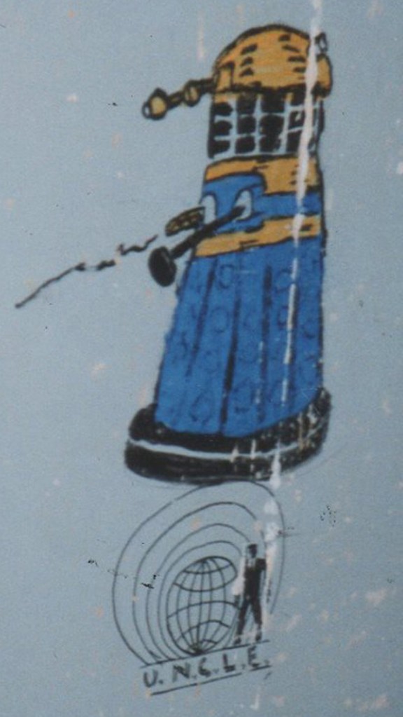
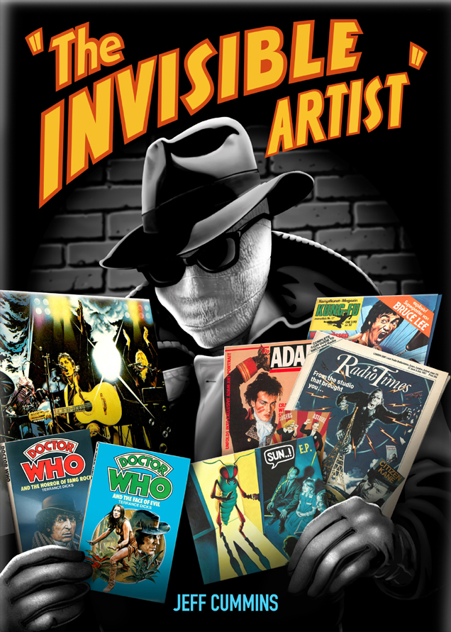
He’s recalling an impressive felt-tip Dalek drawn on the bedroom wall of the Cummins family home, circa 1964. Jeff was nine years old at the time, growing up in the tiny Welsh village of Greenfield. It’s an illustration included in The Invisible Artist, a sumptuous new book showcasing six decades of Jeff’s evocative artwork, from childhood drawings of his favourite TV shows to best-selling record sleeves for the likes of Paul McCartney and Eric Clapton. And, of course, the Doctor Who illustrations that have become a touchstone for generations of fans: his striking covers for 1970s Target novelisations and 1990s New Adventures books.
“As a kid, I drew whatever switched me on – which was always TV or music,” recalls Jeff. “I even drew, actually on the wallpaper this time, Kenneth Cope as the ghost in Randall And Hopkirk (Deceased). In his white suit, almost life-sized! And it was William Hartnell in Doctor Who that kicked it all off for me. I found him terrifying, like an evil teacher at school. But I loved the grumpy way he stood up to everyone.”
As a 1960s schoolboy, Jeff was never shy in seeking approval for his work, sending carefully-drawn depictions of Tommy Cooper, Kenny Everett and Edward Woodward to the stars themselves. “I was amazed when the pictures came back to me,” he admits. “They always did, and they were always signed!” In 1969, he entered a drawing competition on the Thames TV children’s show Magpie, and a caricature of his favourite footballer – George Best – won first prize in the Over-10s section.
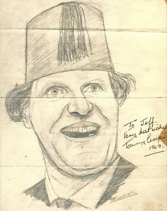
“My mum was absolutely convinced that Tommy Cooper, who was also on Thames, put in a good word for me!” laughs Jeff. “So I clearly didn’t win on merit after all. Still, thanks Tommy!”
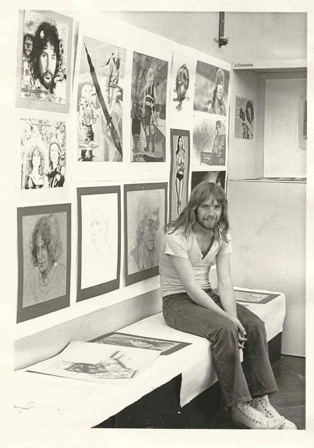
While studying graphic design at Kelsterton College in nearby Connah’s Quay, Jeff was photographed looking every inch the archetypal early 1970s art student. Resplendent in luxuriant hair and flares, he’s surrounded by illustrations of his favourite musicians: Cat Stevens and Marc Bolan. But, on moving to London, it was a painting of the decade’s most iconic martial arts star that led to his breakthrough as a commercial artist.
“Bruce Lee was all the rage,” he recalls. “When he died, I was working for a little marketing company, basically making coffee. But I was also painting relentlessly in my own time. And when I finished the Bruce Lee painting, I sent it to Kung-Fu Monthly. At exactly the right time, because Felix Dennis had just started the magazine and was desperate for illustrations. So he offered me £70! I was thrilled.”
This was 1974. Publisher Felix Dennis was fresh from an infamous obscenity trial, accused of “conspiracy to deprave and corrupt the morals of the young of the realm” with an issue of the underground magazine, Oz. Despite his immersion in the rock counterculture, Jeff was unaware of this… partly because Felix was publishing Kung-Fu Monthly under a suitably exotic pseudonym.
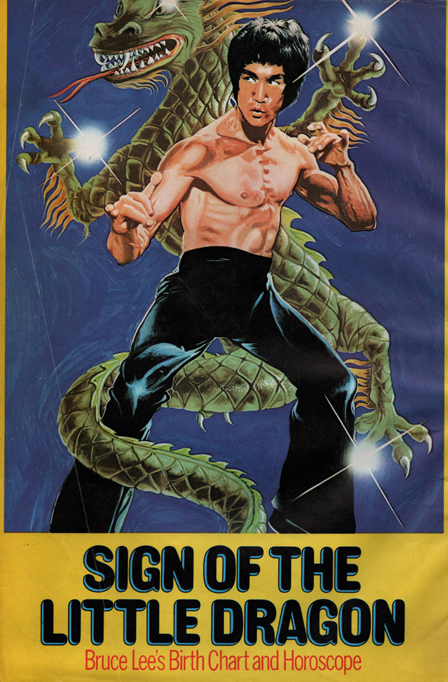
“I thought his name was Felix Yen!” laughs Jeff. “He was great, I got on really well with him. And he started commissioning me for other things, including a magazine called TV Sci-Fi Monthly. Where I did my first Doctor Who painting – Tom Baker on the back cover.”
So was it this painting that led to the approach from Target Books? Jeff is unsure.
“I was blitzing all the publishing companies with my work,” he confesses. “And all the record labels, because I’d always wanted to paint album covers. I was relentless! When I turned up to meet Dom Rodi, the art editor for Target, he’d seen a painting of Albert Einstein that I’d included on my sample sheet. It was quite loosely painted, so Dom coached me to tighten up my work. He gave me a few little projects, and said ‘Try harder!’. Then he asked ‘Do you want to do Doctor Who?’ I said ‘You betcha…’”
With a striking photo-realistic style, Jeff’s Target covers were a contrast to the more stylised work of Target’s resident cover artist, Chris Achilléos.
“I met Chris in the early days, and he seemed a little agitated,” recalls Jeff. “I don’t think he felt he was being treated very well. But there was so much work coming in that they needed other artists. And, in later years, I ended up being really good mates with him.”
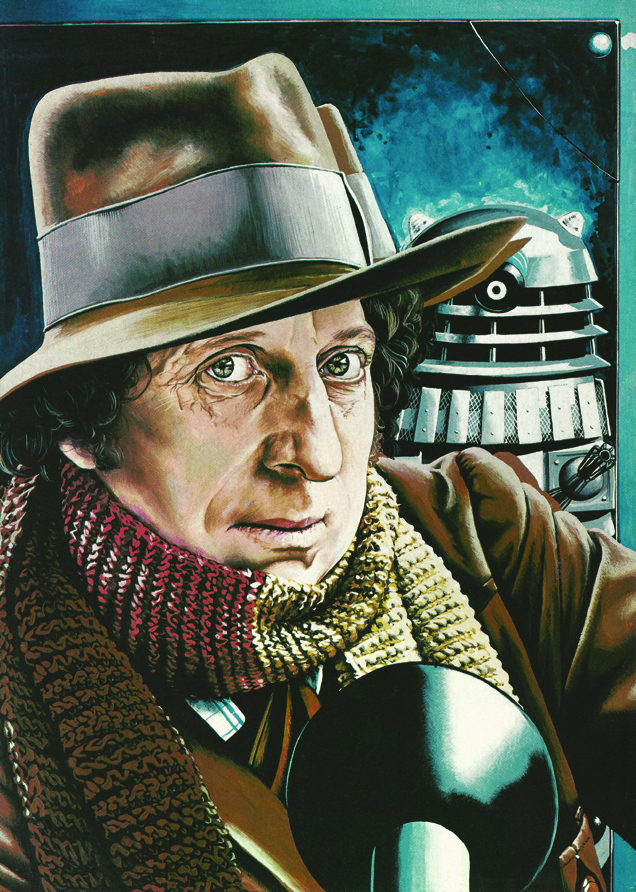
Jeff’s first Target commission was the 1977 cover of Doctor Who and the Talons Of Weng-Chiang. Oddly, its distinctive design has its origins in the work of one of the USA’s most prolific commercial artists. In the early 20th century, Norman Rockwell had painted depictions of everyday American life for the likes of the Saturday Evening Post, and he became an unlikely influence on Jeff’s work for Target.
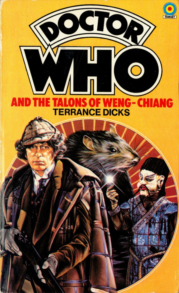
“I was a big prog rock fan,” recalls Jeff. “And Brian Lane, who was manager of the band Yes, lent me a book of Norman Rockwell’s paintings. I absolutely devoured it. If you know Rockwell’s work, you can really see me trying to paint in that style on the early Doctor Who covers. The circles on the front of The Talons of Weng-Chiang and The Face of Evil are pure Rockwell.”
And in the pre-VHS era, did Jeff have exclusive access to BBC tapes of the stories themselves?
“Nope!” he exclaims. “I used to get a basic synopsis of the story, then I’d go down to the BBC offices, where they’d say ‘In there!’ and direct me to a filing cabinet filled with black and white photographs from the episodes. I had to pay copyright fees for them as well – out of my own pocket. So I’d try to design the covers in my head on the spot, while I was looking through them.
“With Doctor Who and the Horror of Fang Rock… when I saw that photo of Tom, I knew it was the one. There was a different photo of him wearing the bowler hat too, but I didn’t pay for that one – I just remembered it. With time being tight, I kept things as simple as possible – and that became my trademark, I suppose. Along with the occasional Rockwell circle!”
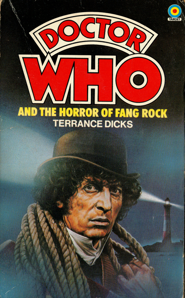
He’s under-selling himself. The cover of Doctor Who and the Horror of Fang Rock not only captures Tom Baker’s distinctive features, it also perfectly encapsulates his performance: the haunted, melancholy side of the Fourth Doctor. It’s a stunning painting that Tom himself has professed to admiring enormously.
“I just recognised those qualities in the photograph, and tried to capture the mood,” shrugs Jeff, with characteristic modesty. “I don’t even think I’ve even seen the actual episode on TV…”
His 1979 cover for Doctor Who And The Doomsday Weapon, meanwhile, features the penetrating gaze of Roger’s Delgado’s Master. An illustration that, apparently, some 1970s children feared would leave them leave them susceptible to the Master’s hypnotic powers. We didn’t look into his eyes, Jeff…
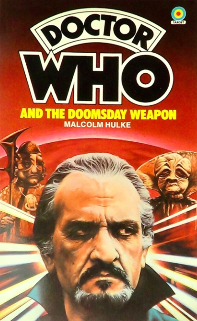
“Oh, I love that!” he exclaims, exploding into laughter. “I’ve had people telling me these were the first books they ever bought for themselves, which is very humbling. But I’ve never heard of people being scared by the Delgado painting – that’s lovely! And I absolutely apologise.”
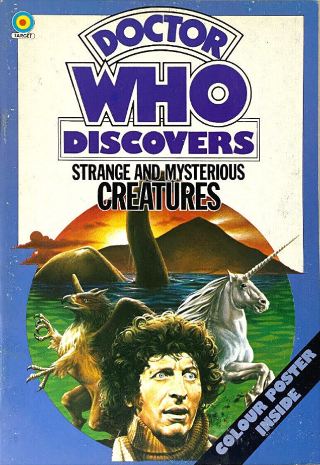
Other Target illustrations included designs for the Doctor Who Discovers range. These factual books were intended as a long-running series, covering perfect primary school topics: Early Man, Prehistoric Animals and Space Travel. Each came with a distinctive cover by Jeff, although he remains frustrated that his illustration of the Loch Ness Monster was obscured by the book’s clumsily-placed subtitle: Strange And Mysterious Creatures. “There you go,” he sighs. “You can only do what you do…” Frustratingly, the series was curtailed after only five releases.
The Invisible Artist also includes glimpses of another abortive project from the same era: illustrations based on The Sea Devils (1972) and Pyramids of Mars (1975) for a mooted 1970s Doctor Who calendar. “It was intended to be me and Chris Achilléos painting six months each,” remembers Jeff. “I made a start on mine, but it never happened. Years later, I mentioned it to Chris at a convention: ‘Do you remember the calendar?’ and I dug out the prints to show him. He said ‘No – I don’t know anything about it!’ Of course, what probably happened was that he’d told them to stuff it…”
With Jeff’s Doctor Who artwork becoming ubiquitous, his career as an illustrator for some decidedly famous rock stars was also taking off. An obsessive Beatles fan, he was thrilled to forge a long-running relationship with Paul McCartney, creating artwork for the US No 1 live album Wings Over America and a string of 1980s singles. “Paul is an absolute sweetheart,” says Jeff. “Although I embarrassed myself a few times in his company, because it’s difficult not to be a fan!”
He also worked on illustrations for the likes of Rainbow and Whitesnake. The cosmic thrills of Doctor Who and the hairy excesses of stadium rock may seem worlds apart, but did he ever feel any connection between the two? It’s possible to make a case for 1970s Doctor Who having a psychedelic edge – Jon Pertwee even dressed a bit like Jimi Hendrix. And some of Jeff’s Target covers could almost be the sleeves of trippy prog rock albums.
“Oh, that’s interesting!” he exclaims. “My missus used to say that, whatever I was working on, it had something of my character. I’d say ‘Oh, I’m just using photographs…’ but obviously there was something going on there, and maybe the love of music translates.”
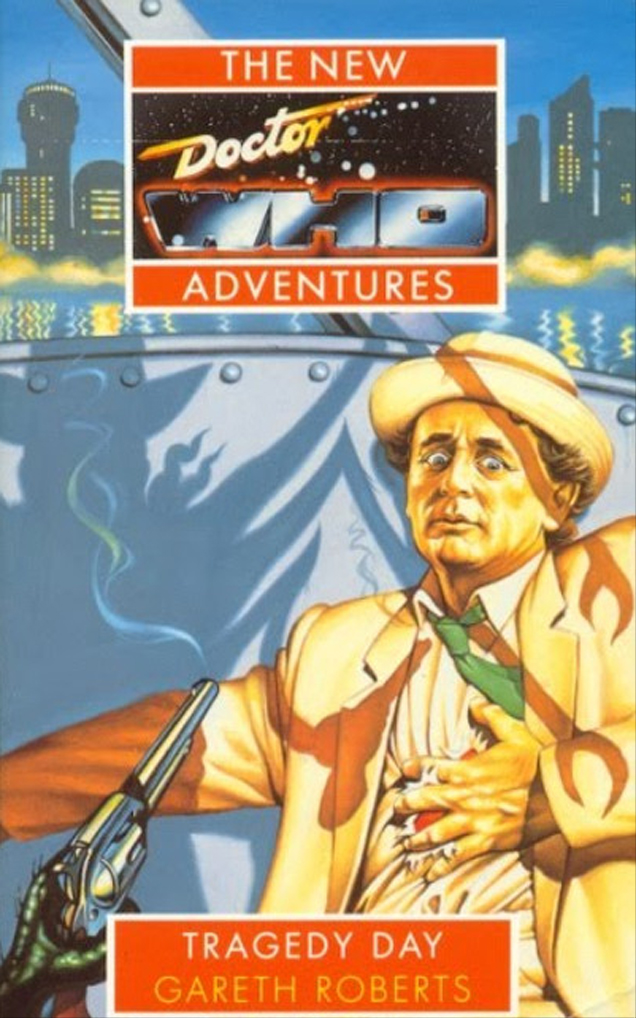
In the 1990s, after over a decade away, Jeff returned to Doctor Who with a series of covers for Virgin Books’ New Adventures series. Here, the publication of non-televised stories “too broad and deep for the small screen” allowed him a freer hand with his illustrations. His paintings of Sylvester McCoy perfectly capture the contrasting sides of the Seventh Doctor: intense and brooding on The Dimension Riders (1993); joyously playful on Sky Pirates! (1995).
“I remembered Sylvester from his 1970s cabaret days with the Ken Campbell Roadshow, and I really liked him,” says Jeff. “But I’m not sure I was really conscious of those two sides to him. I just worked story by story, imagining how he would react to different situations. Obviously, unlike the Target books, I didn’t have specific photo references. So for a lot of those covers, I actually posed myself…”
He’s not joking. The Invisible Artist includes a glorious photo of Jeff slumped against his garden fence, a picture used as direct inspiration for the cover of 1994’s Tragedy Day.
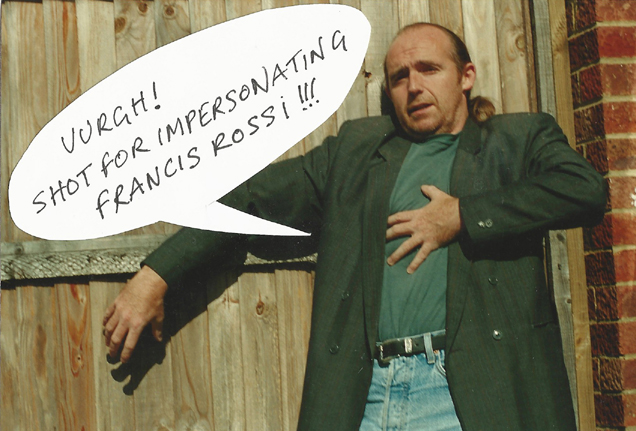
“It’s the one where the Doctor has been shot by a weird spider thing,” chuckles Jeff. “There you go, that’s me being the expert on Doctor Who! I got my wife to take a picture of me staggering back against the fence, and used that as the reference.”
Curiously, the photo has a stuck-on caption: “Uurgh! Shot for impersonating Francis Rossi!”. It’s hard to ignore the fact that 1990s Jeff bore an uncanny resemblance to the legendary Status Quo singer.
He chuckles. “When I was losing my hair, I pulled it back into a pony tail. And I wore the waistcoat, too! I’d be walking around town, and people would shout ‘Oi, Francis!’. I even had to sign his name once… this guy came over while my wife and I were having lunch in Chester. I tried to convince him that I wasn’t actually Francis Rossi, but he insisted I sign a piece of paper for him. My theory is that, somewhere else in the world, the real Francis Rossi was being completely ignored…”
Despite these japes, Jeff seems dissatisfied with the work he did on the New Adventures range. “It was a different era, there was very little time, and I’m not sure my heart was it,” he admits. “So I do have regrets. I tried to gee myself up and get on with it, but I was never really happy with the final paintings. Although people have warmed to them, I think.”
He’s being typically self-effacing. His 1990s work is the perfect encapsulation of Doctor Who’s bittersweet ‘wilderness years’, and forms a crucial section of The Invisible Artist. And, speaking of which… why the title? It is, he reveals wistfully, a reference to his feelings about the anonymous nature of commercial illustration. “I want to promote our industry, I suppose. Because our artwork is all around, but nobody pays it much attention…”
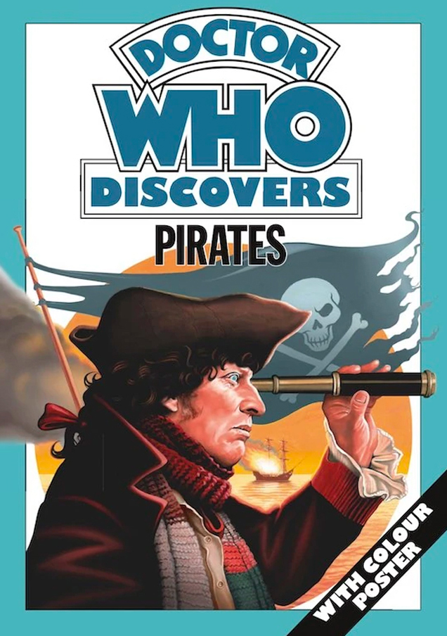
The Invisible Artist, published by Candy Jar Books, should help redress the balance – it’s a beautiful summation of a career well spent. And life has come full circle for the nine-year-old Welsh boy who once drew Daleks beneath his bedroom wallpaper. As we speak, Jeff is working on an exclusive new Doctor Who illustration. It’s the cover of the previously unpublished Doctor Who Discovers Pirates book, originally intended for release in 1978 but available for the first time with this issue of DWM. He seems delighted, and hollers the good-natured farewell of the eternal hippy art student: “It’s been real, man!” And it absolutely has.
The Invisible Artist is available here:
https://www.candy-jar.co.uk/books/theinvisibleartist.html
Doctor Who Magazine is issued monthly – subscribe here:
https://doctorwhomagazine.com/
Support the Haunted Generation website with a Ko-fi donation… thanks!
https://ko-fi.com/hauntedgen
